Why using special formatting on LinkedIn is generally a bad idea
A couple of years ago I noticed some of my coworkers posted on LinkedIn with special formatting in the text. A Bold headline and italics for quotes. The post clearly stood out in the feed - a good metric by marketing standards.
But something felt off about the font.
I checked LinkedIn again some time later and noticed more posts like that. Even public companies had bold letters in their posts. Based on how the letters looked, I started to suspect this was not from the official LinkedIn editor, and that it might not even be real letters.
It was not as bad as I thought, but still something I would advise against - I’ll explain.
Check out LinkedIn Text Formatter to try it out!
What is this magic trickery?
Initially I thought it was Letterlike symbols, or a series of Homoglyphs. Homoglyphs are letters from other languages that resemble our Latin equivalents. They can have totally different sounds though. Here’s a fun example.
Read ВОР.
Not BOP, it says VOR in Cyrillic, meaning THIEF.
Anyway…
The consistency in type suggested the bold letters were part of a set, meant to be used in the same context.
I also found that searching in Safari for a word displayed with formatting would highlight the word as if it was regular text. This was a surprise to me, as it suggested that to my browser 𝗧 == T. Very strange, but then I found the reason.
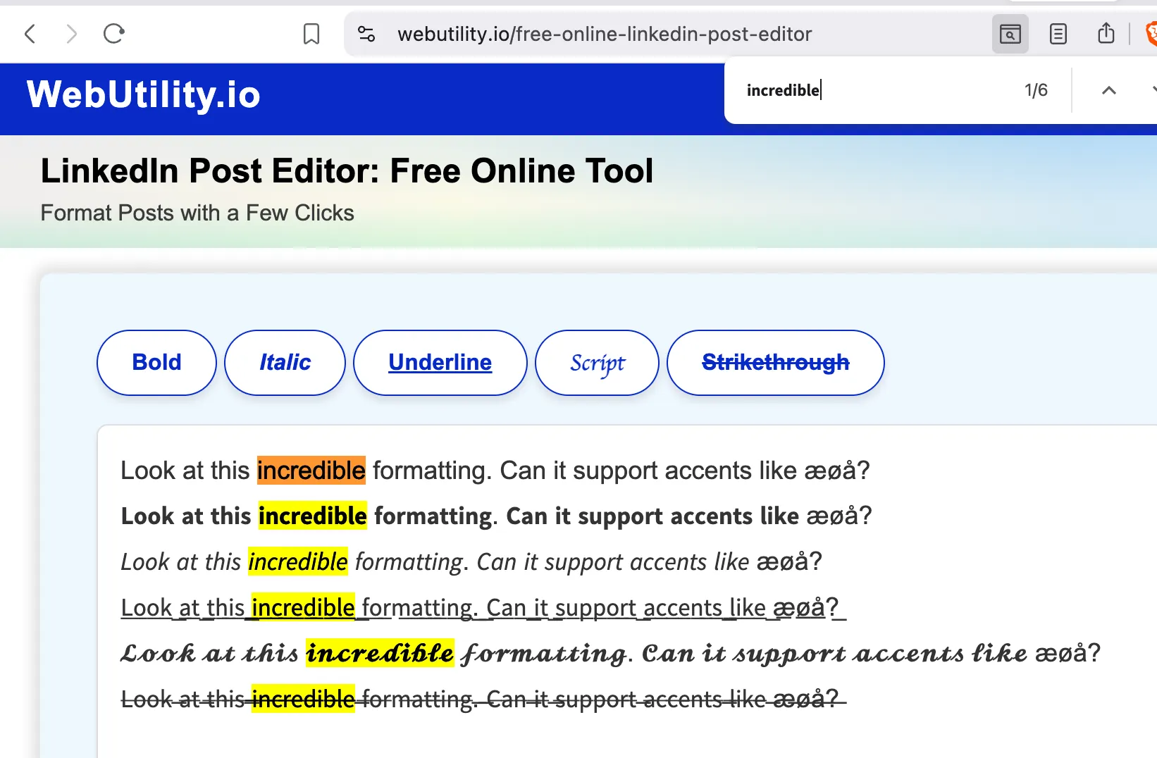
Each line in the screenshot is a set of Mathematic Alphanumeric Symbols. It’s meant to help mathematicians express symbols in formulas in a uniform type. And that’s why my browser actually knows that 𝗧 - aka MATHEMATICAL SANS-SERIF BOLD CAPITAL T - translates to the standard Latin character T
Breaking the rules of text formatting
Should you use formatting like this?
No!
But you will probably do it anyway, so here are the implications.
1. It doesn’t work on accented characters like æøå

Seen clearly in the screenshot, and always noticeable on posts I’ve seen on LinkedIn, letter accents - aka Combining Diacritical Marks - are not formatted. You can add a diacritic to most of the Basic Latin Characters:
- a with the diacritic ̊ becomes the Scandinavian letter å
- n with the diacritic ~ becomes the Spanish letter ñ
- u with the diacritics ¨ and ` becomes this cute little owl figure ǜ (actually Chinese phonetics)
Is it possible though?
Yes, of course. Let’s try creating the letter å based on this mathematical 𝗮 symbol from the formatter tool.
| Symbol | Unicode |
|---|---|
| 𝗮 | \uD835 \uDDEE |
| ̊ | \u030A |
| 𝗮̊ | \uD835 \uDDEE + \u030A |
So it can be done, if the creators of these tools had put a bit more engineering effort into it. Screenshot below is from Brave on Mac. It will not look the same on all operating systems.

I’ve worked with enough designers to know they would never allow a font without proper accent support on a branded website. To me the vibe is 𝐒𝖕𝙖ⓜ🅼Ɏ
2. It’s a technique used by spammers
The reason it feels like spam is that it’s exactly the same trick spammers used years ago. When spam filters were limited to checking certain words in an email, special characters was used to fool the filter. Simple times.
Here’s an example:
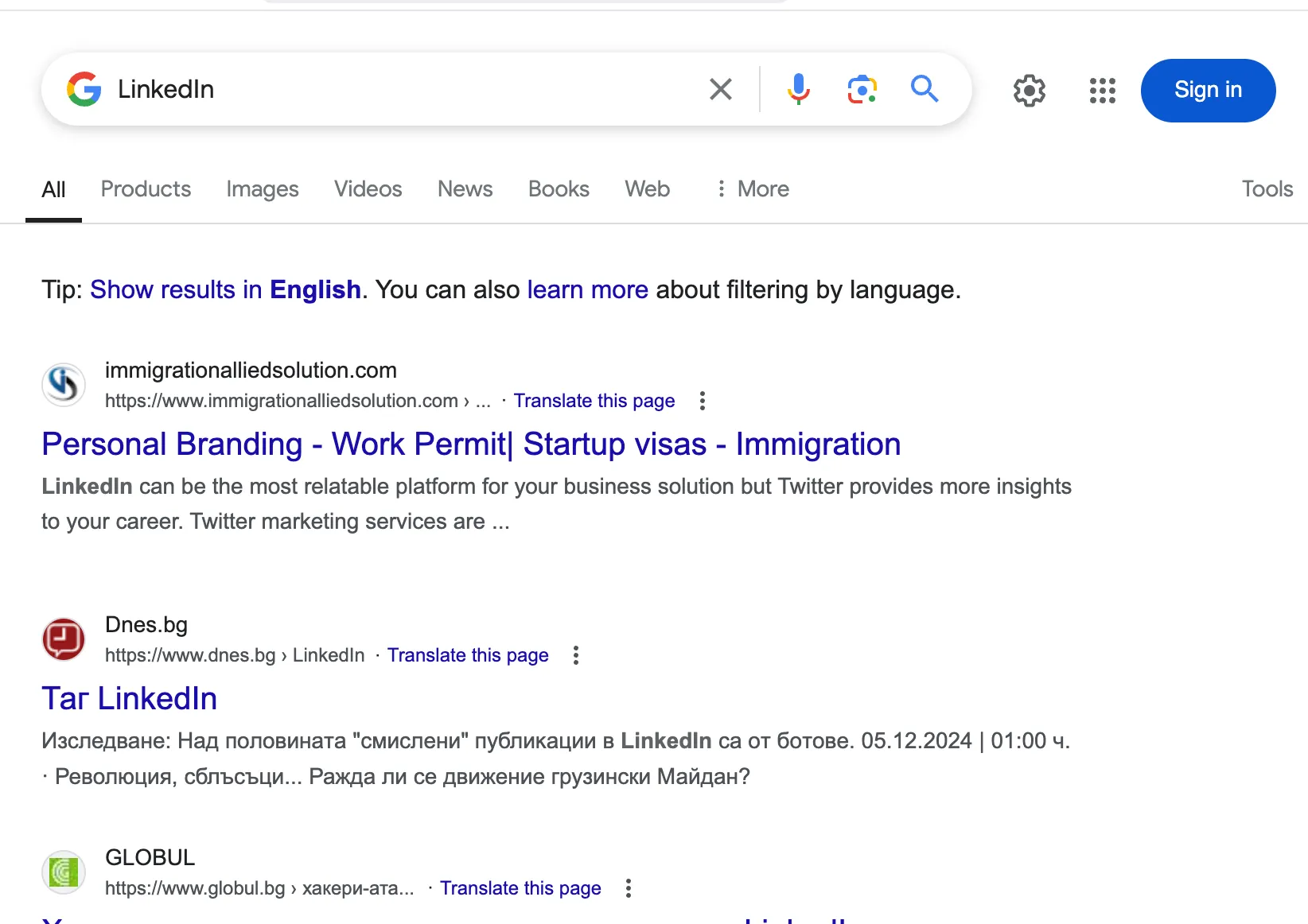
Notice how it looks like there’s no legit search results for LіnkеdІn. That’s because this is what Google sees:
L\u0456nk\u0435d\u0406n
Hiding what you’re communicating by obfuscating the text is not ideal outside the realm of spam filters.
3. It’s not easily searchable
Searching within LinkedIn or Google for text formatted with Alphanumeric Symbols will probably yield results - most of the time.
I found some that worked via Google Search. I could search with the Unicode formatted string or with regular ASCII characters and I got the same results. I assume it worked because Google did the extra engineering effort in their search engine.
Here’s an example from LinkedIn though. I search for the faux headline in the post: “Sopra Steria poursuit son expansion au Canada”
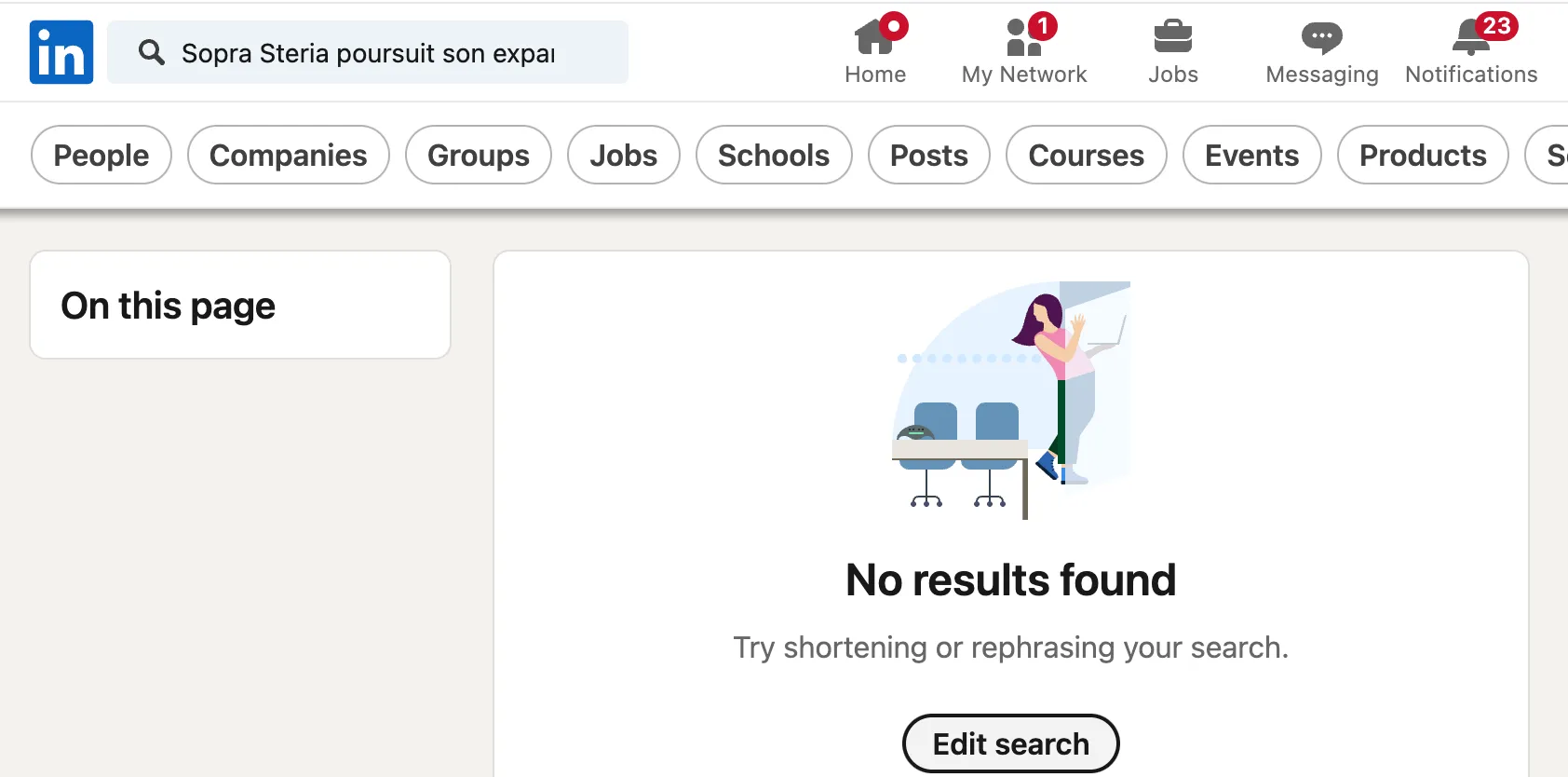
Woot!
I could only find the post by using the exact same formatting as the author, like this: ”𝗦𝗼𝗽𝗿𝗮 𝗦𝘁𝗲𝗿𝗶𝗮 𝗽𝗼𝘂𝗿𝘀𝘂𝗶𝘁 𝘀𝗼𝗻 𝗲𝘅𝗽𝗮𝗻𝘀𝗶𝗼𝗻 𝗮𝘂 𝗖𝗮𝗻𝗮𝗱𝗮”
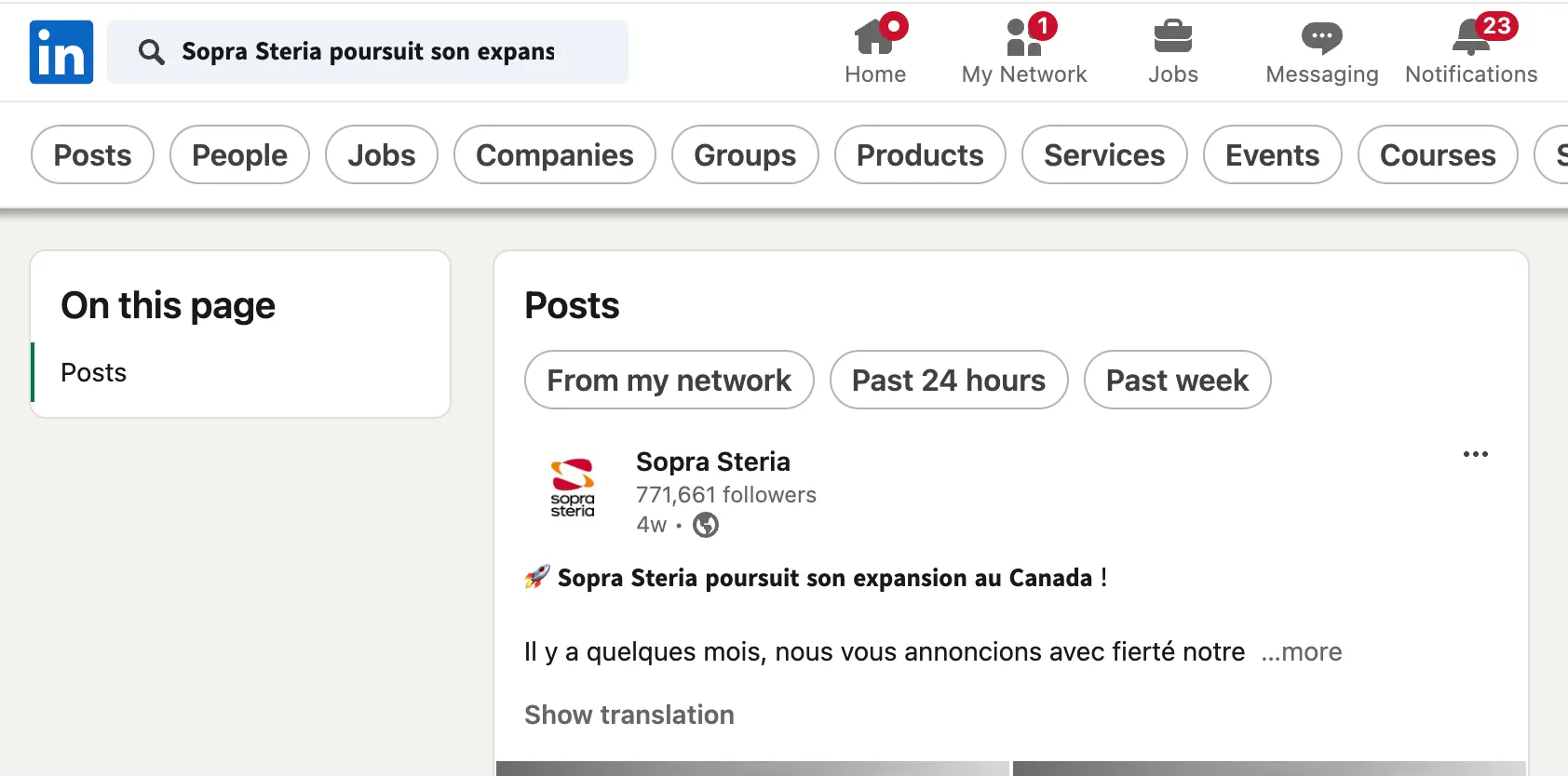 [Link to post](https://www.linkedin.com/posts/soprasteria_innovation-transformationdigitale-montraezal-activity-7275580577146146817-IPcv
Why would you risk hiding your content from search results on the platform you are posting to?
4. You’re ignoring people with disabilities and annoying many others
Most people’s eyes will easily recognize the words generated by these symbols. But not everyone use their eyes to read. Obviously, people with poor eye sight might use Assistive reading technologies like Braille through a Screen Reader. Assistive Reading is not only for the blind though.
I’ve used techniques like:
- Let Google Hub read a recipe while I cook.
- Copied text out of the browser and into structured note taking apps like Tana Inc.
- Reader mode in Safari to hide non essential text in news articles
- Safari Speech to read a text while I write keywords.
These things will not work with formatted text.
In the EU there are laws against ignoring disabled people on a public website. Here in Norway the law also applies to private websites. Social Media and Blogs are exempt (I think, I’m not a lawyer), but why would you deliberately hide your message?
I can read this in Braille is
⠊⠀⠉⠁⠝⠀⠗⠑⠁⠙⠀⠞⠓⠊⠎
𝗜 𝗰𝗮𝗻 𝗿𝗲𝗮𝗱 𝘁𝗵𝗶𝘀 in Braille is
⠀⠀⠀⠀⠀⠀⠀⠀⠀⠀⠀⠀⠀⠀⠀⠀⠀
Oh…

5. It’s just not the intended way
My weakest argument, but still the one I’m most passionate about.
Text is data. Data can be tweaked, aggregated, analyzed, processed, printed, replicated, interpreted and consumed. If a simple text block cannot be used as data I might as well post a photo. Then I can have whatever formatting I want.
It’s not that important on a LinkedIn post of course. They are ephemeral, consumed mainly on new hardware by users who know very well what a computer is. But who knows what the future brings? The following would not be possible without some degree of structured text representation.
- The transition from desktops to small mobile screens.
- The use of voice assistants in our homes
- The emergence of LLMs like ChatGPT
- Autocorrect sending embarrassing texts to your coworkers
- Disabled people using the internet
- Automatic text translation
- Finding stuff you want to buy online
- GDPR compliance
My humble opinion is that we should treat text as just text whenever possible.
Footnotes
-
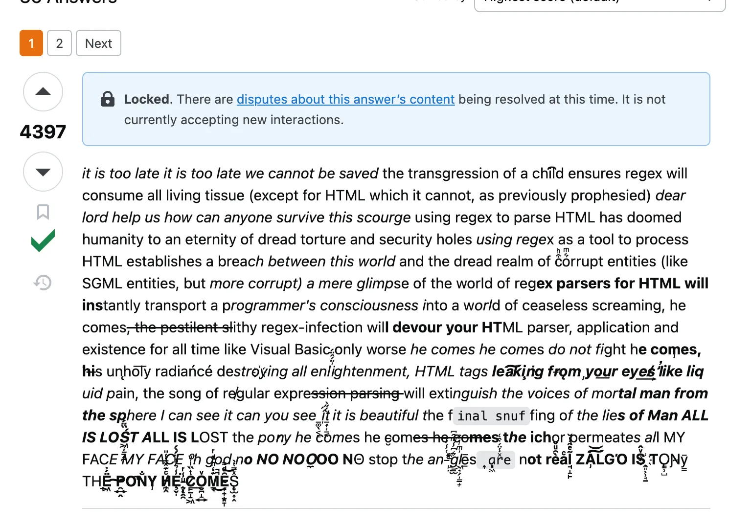
Taken to the extreme, a combination of diacritics and other symbols can be almost frightening to look at. Source
-
I found this formatting generator from a fellow Scandinavian engineer after writing this blog post. It has support for 𝗮̊, but 𝗼̷ looks a bit weird and æ seems unsupported.
-
Emojis are also Unicode symbols. That’s why they don’t look the same on all devices. One of the most famous examples last year was how the gun emoji looks on X vs Apple.
-
I think these Unicode emojis are pretty cool, because they consists of letters and diacritical marks, but they will not work on all devices: ٩(-̮̮̃-̃)۶ ٩(●̮̮̃•̃)۶ ٩(-̮̮̃•̃). Source
-
This one is almost evil. It will overflow out of most defined areas. Try it on LinkedIn if you want to break stuff. ‘°͌͌͌͌͌͌͌͌͌͌͌͌͌͌͌͌͌͌͌͌͌͌͌͌͌’ This is Unicode abuse and I like it. Full sequence is
‘\u00B0\u034C\u034C\u034C\u034C\u034C\u034C\u034C\u034C\u034C\u034C\u034C\u034C\u034C\u034C\u034C\u034C\u034C\u034C\u034C\u034C\u034C\u034C\u034C\u034C\u034C’
